Community Solutions
Interactive Map
IREX needed an effective way to visualize the projects and beneficiaries of their Community Solutions Program. After carefully considering the multiple levels of information and budget limitations, we decided that an interactive map would be the best solution. The map not only shows the expansive reach of the program, but also provides an enjoyable way to learn the stories of each unique project.

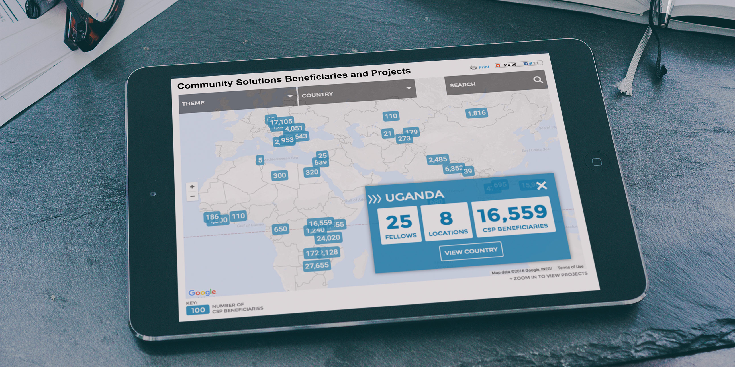
World Level
Worldwide Beneficiaries show breadth of impact
We visualize the breadth of the program by showing how many beneficiaries there are and where they are located around the world. This quickly communicates that the Community Solutions Programs has projects all over the world.
Country Level
Types of Impact by Category and Country
One level deeper, the map shows the type of projects happening in any country. The user can filter these at any time based on four main categories. These clarify what kinds of problems leaders are working to solve in a given country. Images of these leaders invite the user to learn more.
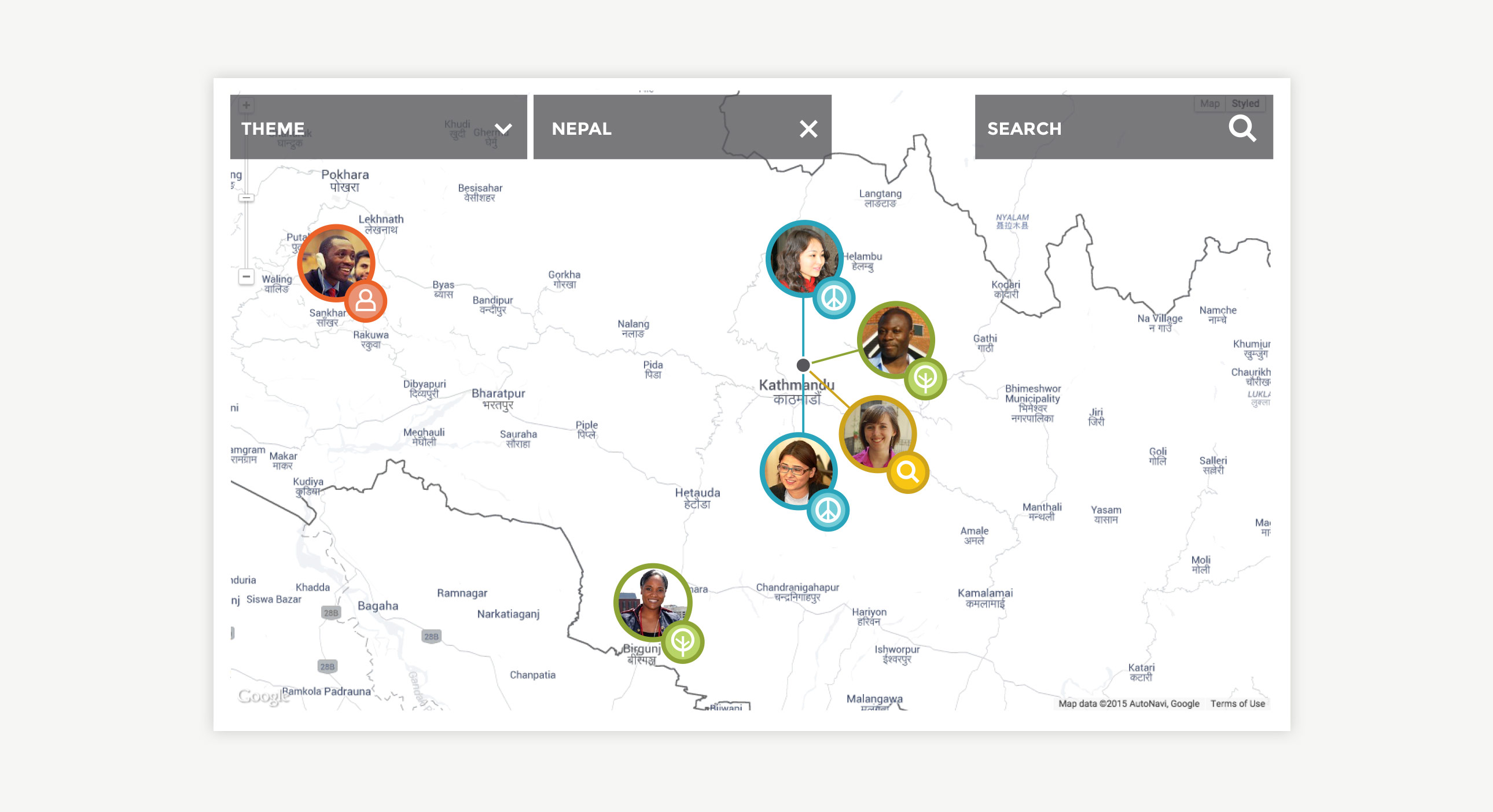
Projects in Nepal
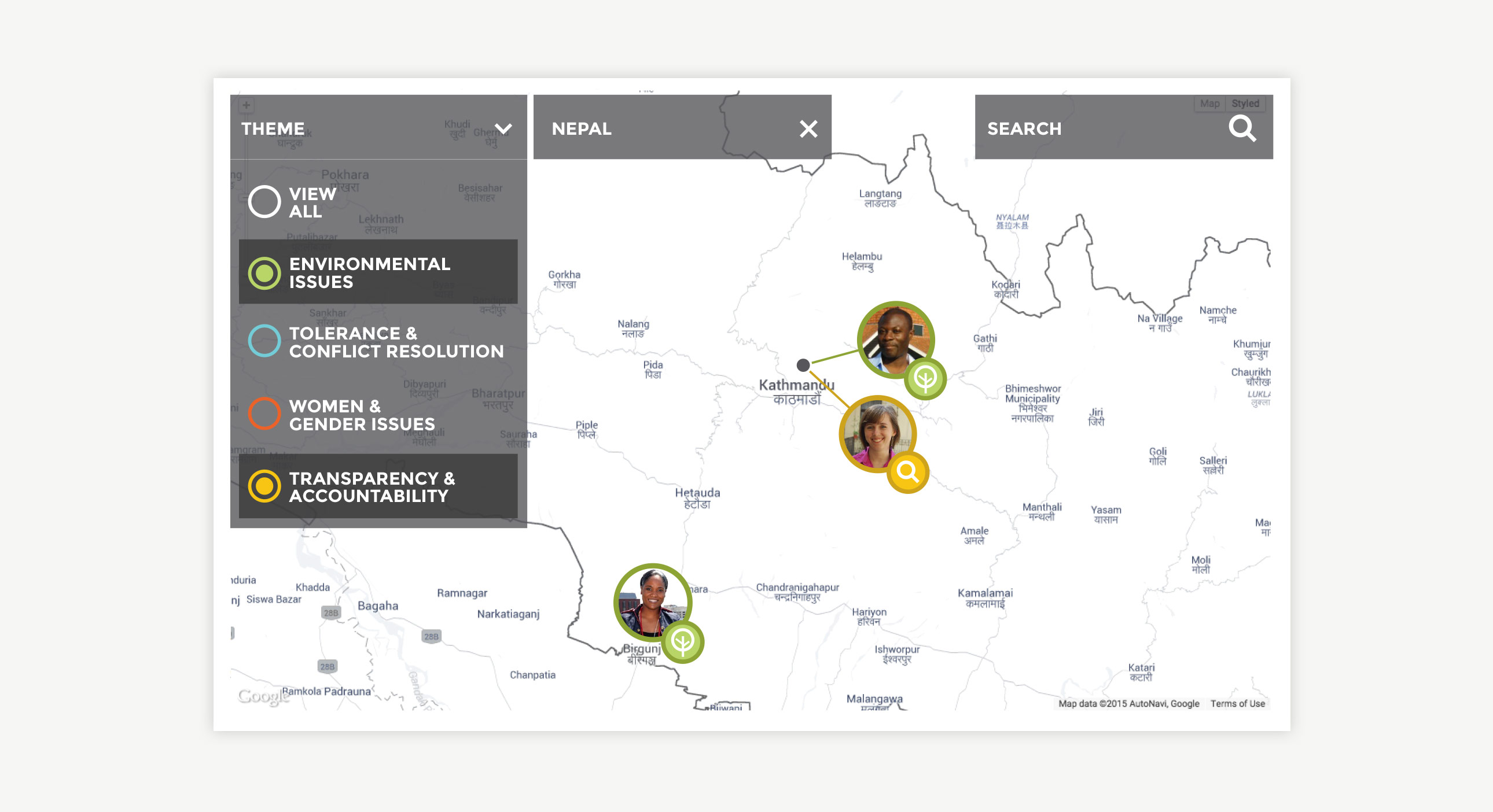
Projects Filtered by Theme
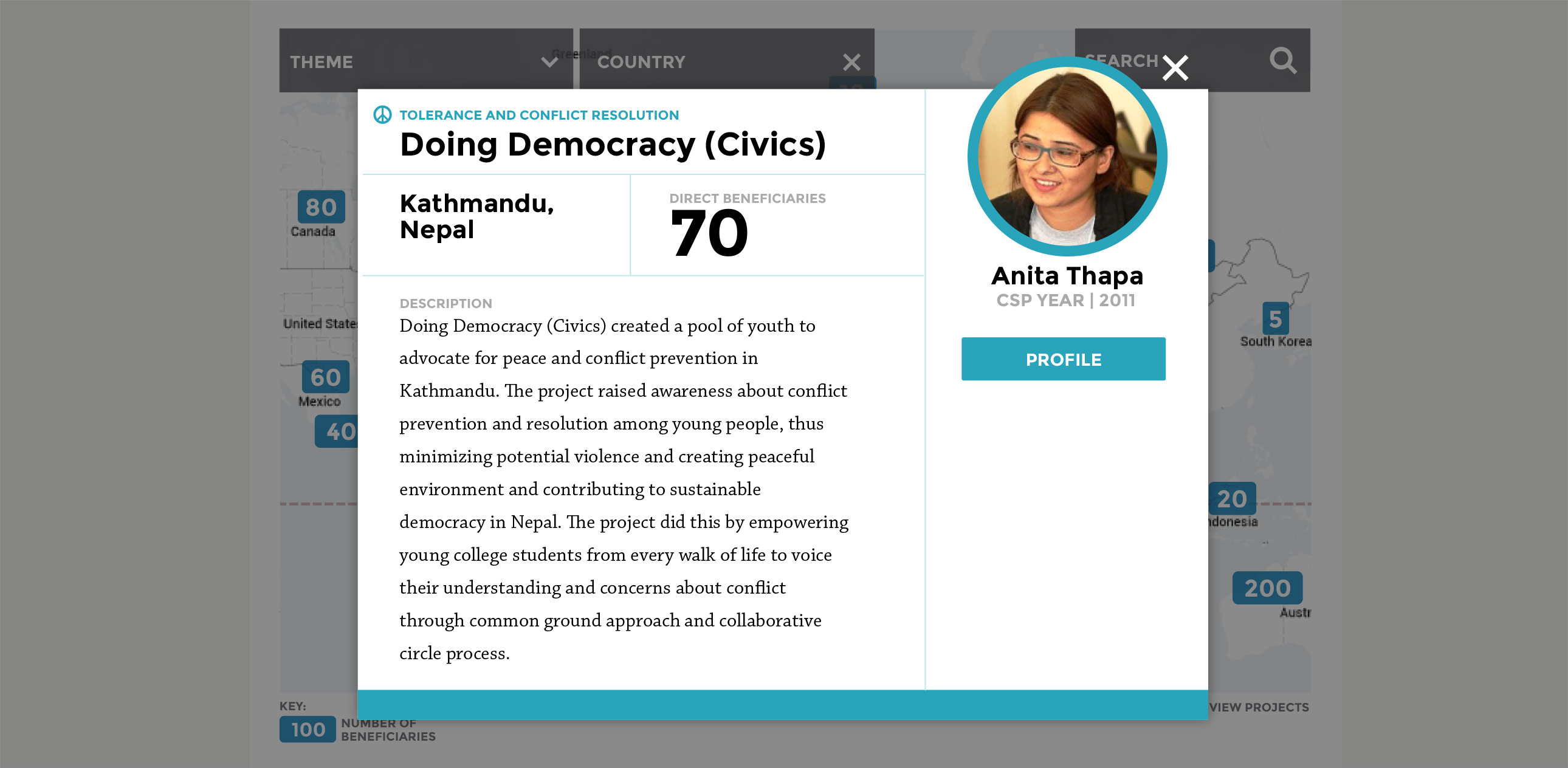
Project Level
Depth of Impact through Individual Stories
Clicking a pin reveals a unique story—something that can be more valuable than numbers alone—as well as the face behind the work. These stories and images are what really help the user draw meaningful connections between this program and it’s impact. I worked on this project at openbox9.